Soma Realign
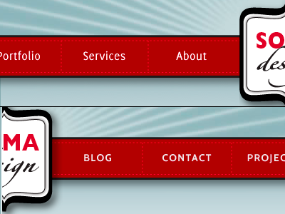
I used Jos Buivenga's Delicious (above) on my original design for my Soma Design site a little over 3 years ago for a very pragmatic reason: it was free and I was starting out. My logo uses Gill Sans, and Delicious never quite sat properly next to Gill. But I didn't want to make the switch unless I could use Gill with @font-face embedding.
When Pablo Impallari put out his free, Gill Sans-inspired Cabin, I knew that the time had come for a change. A couple hours of work later, Soma Design feels more like it should have all along.
PS The colours turned out really weird in this .png and I couldn't be bothered to fix it.