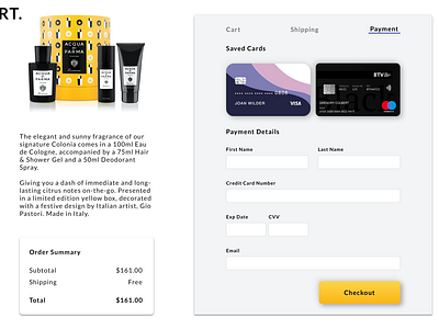
Credit Card Checkout Page
This was an interesting project for me because I worked on this, and then I got really busy for a few weeks before I stepped back to finish this. This lets me look at the partly finished work with a fresh set of eyes. Because of that, I made some design decisions about changing the purple color scheme into a black/yellow color scheme. Overall, this was an exciting project for me. Thanks for looking at it!
More by Rohit Tota View profile
Like
