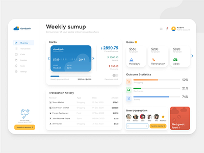
Cloudcash Financial Dashboard
I wanted to present a lot of data in a clean way. Blue card helps user to focus on the most important section with balance summary. Second component that is need to be focused is Get loan button. The third point of focus is placed in the left bottom corner with information about premium account.
Please leave like if you like it. 😊
More by Piotr Śmiałek View profile
Like
