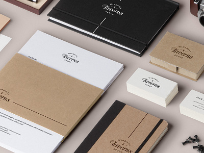
Windmill Taverns Branding
Spent most of yesterday developing the Windmill Taverns brand and exploring more font options. We felt that taking it down a slightly classier, traditional route was more in-line with the client's requirements (plus - how can you not love that swirl on the 'T'?).
Make sure you check 2x for a more detailed view, also we've attached the logo on it's own for a better look.
Feedback is appreciated!
More by Unseen Studio® View profile
Like

