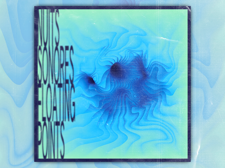
Floating Points Cover Art
Another alternative Floating Points cover art!
Here I was playing with a new concept - making the foreground text blurry to capture the viewers attention and make the background graphic more tangible. I'm pretty happy with how it plays out! While it's not super practical for most design projects, I think it works well in an abstract cover art design. Let me know what you think!
More by Evvia Gonzales View profile
Like
