SADOVA TEHNIKA. REBRANDING


"Sadova Tekhnika" is the official dealer of the Swedish equipment Huqsuarna.
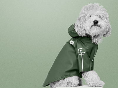
Our task was to add clear images and Scandinavian style to the company. Another strict condition was the development of a unique sign that would match the Huqsuarna logo.
After analyzing competitors, visiting an offline point, and a detailed briefing, we have found a solution. It means the balance between simplicity and meaning through a symbol. It resembles a Scandinavian rune, while it is a monogram (a combination of letters C and T). The square inside the symbol is a reference to a flat lawn. Depending on the context, we can put other signs within the logo. The logo also has a full version that is a company name in a simple geometric font. It complements the general idea of identity and creates a unity with the sign.
We chose the corporate colors also based on the company's specialization. Two shades of green complement each other to emphasize simple geometric shapes.
