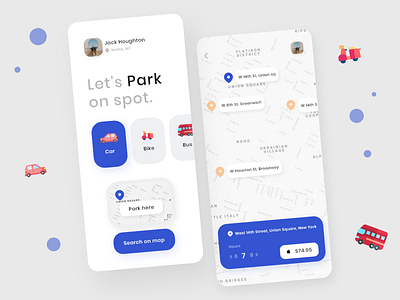
Parking App Concept
This is just a concept/experimental design I did to kill time and have a little practice on creative thinking. The first screen is totally not a pragmatic approach, it is more of a playful minimal User Interface however the Second screen with the map(NYC) has a bit more of a pragmatic approach to it. This experiment also helped acknowledge that there can be a balance in Creative and Pragmatic approach to design.
Hope you guys like it 👍
If you want to work with me then click that "Hire Me" button duh! 😂 or if you're looking to connect with me I'm on Twitter 🎉
More by Abraham View profile
Like
