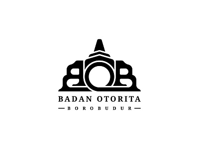
Badan Otorita Borobudur Logo
The logo of the Badan Otorita Borobudur (BOB) that I created is a form of one of the stupas in the Borobudur temple placed in Indonesia. If you look closely at the center, which is the letter O, I made it in such a way as to resemble a stupa. Like the BOB in the Borobudur tourism area. The shape of the letter B in this logo I make one of the letters B upside down to make it look aesthetically pleasing and from that to make it look like a gate/entrance to the Borobudur temple. Apart from that, in order for the logo to look synchronous and aesthetically pleasing, like a calculated building. This logo is getting eliminated when I participate in their logo contest.
To see the full presentation of this logo, feel free to check my Behance profile
More by Arip Purnomo View profile
Like
