Web-article about Apple logo history
Hello dribbblers!
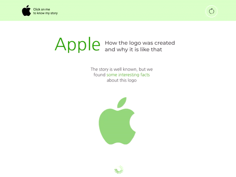
Today I want to show you something unusual. This is an article in landing page format about the history of the Apple logo.
You will say : "The design and decoration is completely contrary to the style of the brand." Yep! You`ll be right! And now I will explain the reason.
One of the slogans of company is "Think diferent". Therefore, the apple is inverted. It flies through the chronology of time and falls on the head of Steve Jobs, as once fell to Newton. And color is also an unusual solution. It is my subjective association with the apple, which does not fit with the brand. But the name "apple" with a series of digital products is also non-standard solution. Explaining the idea, I refer to the fact that the design itself wanted to hint that the idea of creating a logo and the idea of a brand in general is extraordinary. The article is still about NON-STANDARD UNKNOWN AND INTERESTING FACTS.
So, let`s think different, guys,
and thanks for attention!