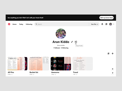
Pinterest profile page redesign
oday I wanted to take on the long-forgotten 100 days UI Challenge. But, instead of designing a whole new page tried to redesign an existing page. So, for day 6 challenge I redesigned the Pinterest profile page.
I made 3 changes in this redesign in order to improve the experience for the new user. Cause, an experienced user may not encounter the below-mentioned problems.
1. Added tool-tip for icons: Because new users may not be able to understand what these icons do. Especially the share profile and 2 add icons.
2. Changed the placement of Edit profile and Share profile icons: As these icons look like they are associated with the boards more than with the profile, the chance of being misunderstood as edit boards and upload boards somewhere is more.
3. Changed share icon: The share icon looks more like an upload icon than share. Because this icon is used as an upload icon in most of the websites. So, the chance of being misunderstood increases, especially for new users
