Abigail Borg earlier proposal
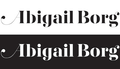
An earlier proposal included a different g for Abigail to compensate the two words: First feature complex forms, the second very simple: g help to regularise. The forthcoming Abigail Borg logotype feature almost two identical g: just the ear is different. http://www.facebook.com/photo.php?fbid=10150147583341509
Does the earlier proposal was better than the final accepted version?
ps. Based on AW Conqueror Didot.