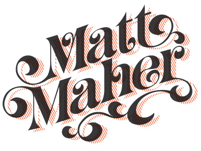
Matt Maher logo
Derrick, I've got some diagonal line shadow stuff happening right now too, though I think your State of Devotion logo is holding together a little better. I think the negative space between letter and shadow is key. Nice.
More by Tim Parker View profile
Like

