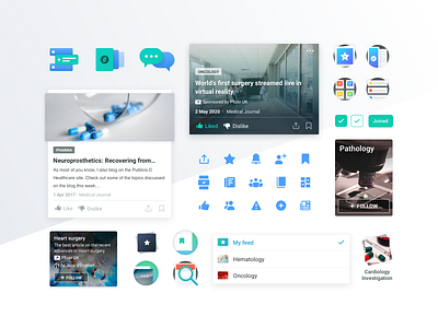
Medit • Components
Hey everyone 🏀
It's time to post another shot of Medit iOS App - a digital product built to help the Healthcare community keep updated on the most relevant medical content.
While we strived to guarantee the design felt fresh, we knew it shouldn’t fall too far off when it came to navigation patterns.
It was essential that users felt they knew what they were doing and every behavior was expected. As a native iOS App, we tried to guarantee recognizable patterns to make sure we guided users in the right direction.
What do you think about this set of components?
Read the full story and take a look at other design decisions that were crucial in this project → Case Study
— If you like our work follow us on Twitter, Facebook, Instagram and/or Behance.
____________
Ready to design a healthcare product that users love?
We can help you build it. Here's how.
