Mais Compras Logo and home page
Hey guys,
So a few weeks ago I posted the logo animation of Mais Compras (https://dribbble.com/shots/14249920-Mais-Compras-logo-animation), an app for groceries delivery. So now I want to share a few more things about the logo and the UI that the App has.
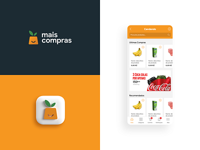
1. The logo is an orange in a shape of a shopping bag, but some people mistook for a carrot (which we did not wanted to because of Instacart)
2. We tried to put the logo on darker background to see how if it works
3. We tried to transform the icon into some type of avatar to be more alive, making a 3D image of the icon in an app box.
4. The UI of the homepage (which you might not understand the text because its in Portuguese) had the search bar on top, since its a groceries app, easy search had be a priority so the groceries are found faster. We combined lighter colors like wihite and grey and just some touches of orange to make it more user friendly.
So what do you guys think?