Twitter Lite Part.1
Getting back on this little project and revamping everything from the previous shot with way more content this time.
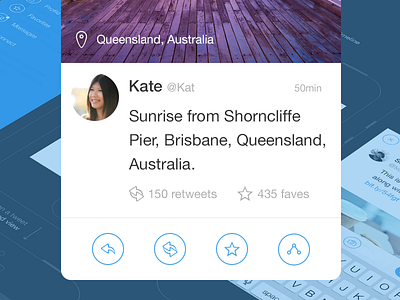
As much as I like the current Twitter app interface, I wanted to take a stab at the current visual UI and UX to make it as light as possible and focus on what I need as a user. Some sort of my version of a perfect Twitter app, as a personal exercise and for fun.
Check the full preview for all the screens.
The app gives the priority to the primary timeline and tweet composing.
Swiping from the left bevel brings the writing interface, swiping from the right bevel brings you the general menu where you can switch the content of the main screen (timeline by default).
Tapping a tweet brings you the floating detailed view.
You'll notice a big increase in whitespace and line-height (I used a 10pt grid) and the iOS status bar is only displayed when the menu is active (hello FB paper). I also removed inline reply, retweet and favorite button/counter to reduce visual clutter.
----------
Icons from the Thin rounded icon pack.
User pictures from uiFaces.

