Studbud - Updated Style Tile
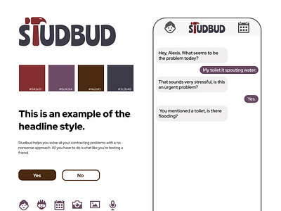
I updated the color palette on a previous school project design. I pulled these colors from a photo of a construction site. I think this palette works better than the last palette I used. The other palette had bright neon colors which I pulled the primary orange from an actual stud-bud and then used it's triadic colors to form the palette. I think the current color palettes work better for the design because they're muted so they're not as loud. They do a better job of highlighting CTAs without overpowering the design as a whole. You can check out the previous work by digging into my Dribbble profile if you feel like it. What do you think?
Icons from Iconmonstr