Landing Page for ERP Tool
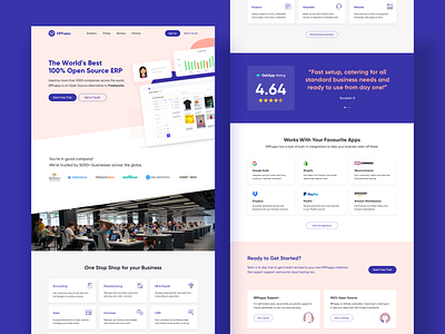
I recently designed a Landing Page for a tool called ERPuppy (pseudo name), which is a 100% Open Source tool catering to multiple aspects of running a business.
The idea behind designing the page was to emphasize more on the utility of the tool, how it matches up to or even exceeds the standards set by a few other players, as well as combine/merge well with tools you're familiar with.
The entire page makes use of two major brand colors - blue and light orange. The contrast offered by the two colors is amazing and hence most sections have entirely been designed with these two tones only, except for the illustrations.
Happy to hear your thoughts!
More by Rohit M View profile
Like
