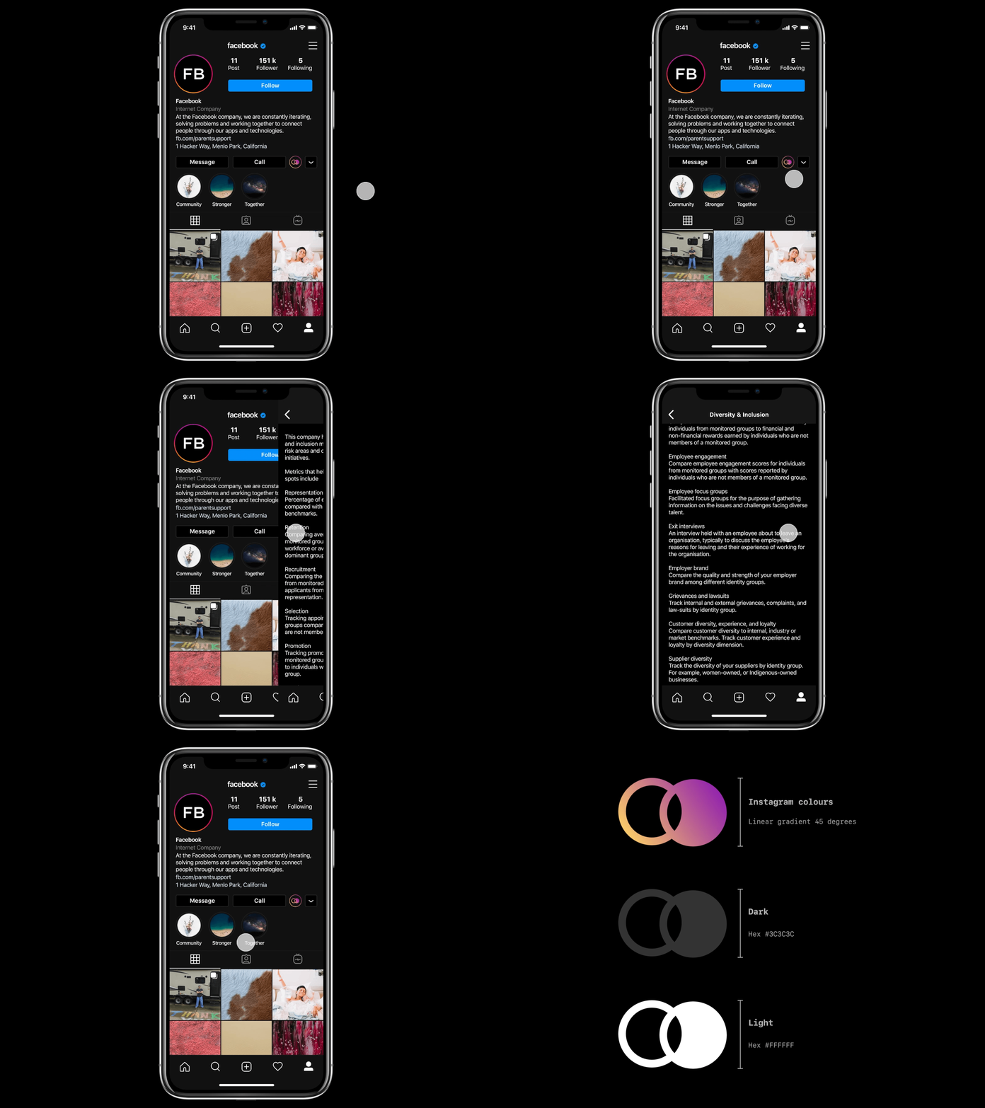
Instagram Diversity & Inclusion Concept
There are lots of sources that try to rank some of the "big" companies in terms of diversity and Inclusion. You have to do a lot of digging to find out how these are calculated. When you look into the calculations, none of them seem to be a fair representation of what they are trying to calculate. After all, diversity and Inclusion in the workplace is incredibly complex - I'm not sure it could ever be calculated accurately.
But what if it was made visible which companies are actively striving to use diversity and inclusion metrics rigorously and consistently to identify bias blind spots?
What if you didn't have to do much digging to see which companies do this?
I put together a concept piece of an icon and how it could be used across social media platforms and the rest of the web to serve this very premise. I appreciate that sticking a badge on a social media page doesn't even begin to solve the problem. But what it could do is provide greater visibility of companies that are striving to do so.
UI changes to Instagram - Follow button moved immediately below followers etc. metrics - Message and call button width resized from 97 px to 129 px - Diversity & Inclusion icon added
