Page Editor Sidebars


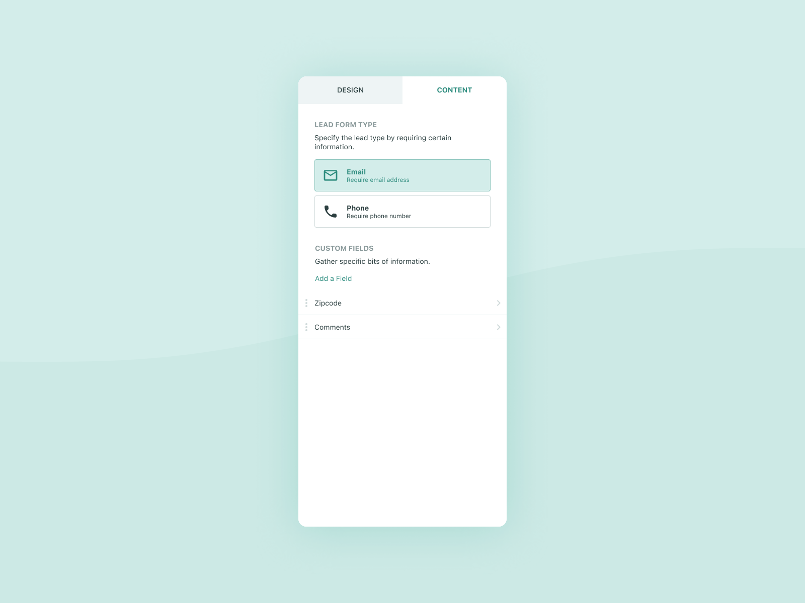

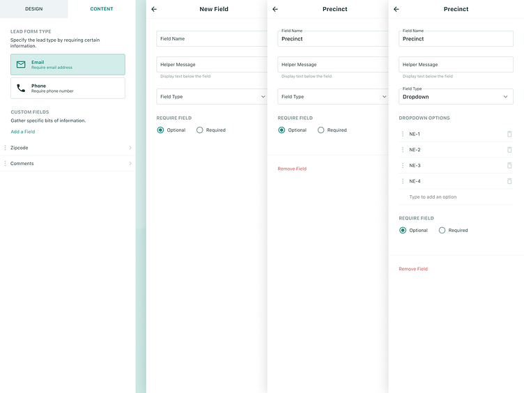

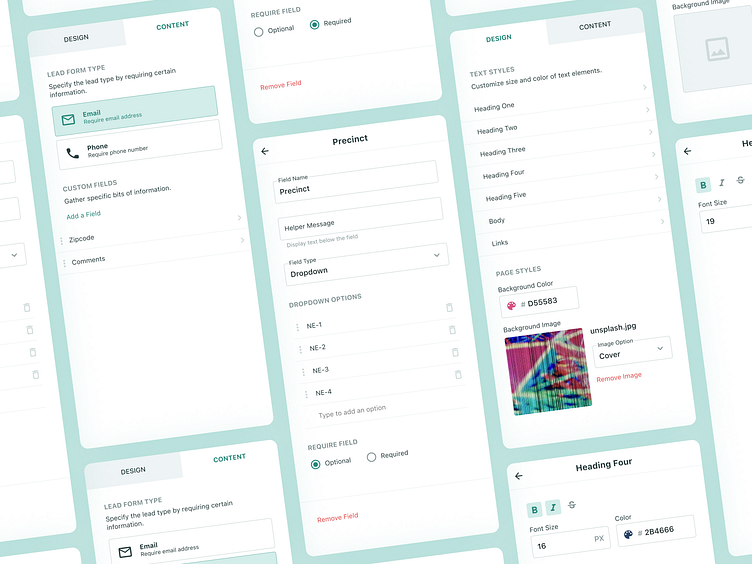


As with most page editors, we had a lot of options and controls to display in a small space. We went with a preview + sidebar/inspector layout for the editor. This allowed us to put all the controls in the sidebar and make plenty of room for the preview in the right-hand column.
Some of the main objectives here were to:
1.) Display these controls in the most simple way given the space constraints.
2.) Make the controls feel optional so if the user wanted to just stick with defaults, it would be super easy to just skip ahead. Meaning we didn’t want to overwhelm new users with a bunch of options that they may not need at this point.
3.) Make the controls simple for the power users to customize their page as they see fit.
I love how this came out and unfortunately, by the time I left the company, most of this hadn’t been shipped yet.
If you’re interested, I threw together a little prototype demonstrating some of the interaction.
Stay tuned for more on this project!
========
If you like what you see here, I’d greatly appreciate if you went ahead and hit that ❤️!
I am currently accepting projects. If you or anyone you know is needing some UI/X assistance, I’d be more than happy to help out!
Let’s make something. 📲