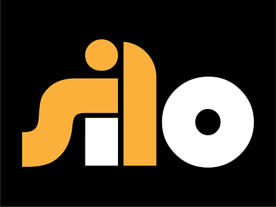
Software Silo Logo
We wanted to make a strong, simple and clean logo that would make a viewer interested and confident in their company. If you look closely, you can make out a person working at a computer between the letters 'S-I-L'. We felt this was an appropriate image to include as the startup is focused on software development. The 'L' was designed in the shape of a silo to communicate their ability to handle large projects effectively. The 'O' is similar, instead of taking on a bird's eye view of a silo.
More by Gavin Krohman View profile
Like
