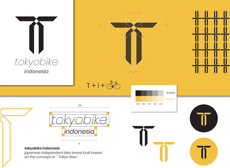
Logo identity ( tokyobike)
Good day everyone
-
tokyobike indonesia 🚲 ( @tokyobikeid ) Rebrand
By @waelf.design 🖤💛
It’s Japanese independent bike brand built based on the concept of “ Tolyo Slow “ .
-
what is “ Tolyo Slow “ it’s also a small independent japanese bicycle company founded in 2002 and the initial goal was to sell bikes “ for the city “ .
-
How i came out with the idea or why i choosed this company?
-
I was searching on IG and FB of some companies that dont have an icon or as we say it’s some of the brand that calls you to rebrand them ! dont know why but it does happen 🙌🏻 this is one of those 🤗.
-
So first i worked to replace the font with sonething more classical and not boldy cause these type of bike 🚲 are classical and i choosed it to be italyc to have the spirit of that kind of bikes .
-
I worked first on the shape of a bike and later i will share with you guys the sketches of it and tryed to make a combination between the initial letters of Tokyobike and Indonesia and also the shape of a bike ! and you can see the results awesome right ?
