Toronto Transit Identity
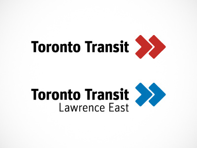
A very small portion of an entire branding project for my university corporate identity course. The goal was to create a more modern and progressive identity for the TTC, which is currently outdated and inconsistent.
The top logo is a collective logo for the entire Toronto Transit system, while individual subway stops are given descriptors, with the icon colour-coded to match the subway line.
The icon consists of an abstraction of two "T"s for "Toronto Transit", made into the formation of an arrow, representing speed and forward movement, while simultaneously echoing the shape of tire tracks and a roadway.