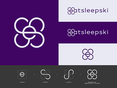
ESS Monogram Logo Design Concept
Monogram Logo Design Concept (2/4) For Eat Sleep Ski!
This design is a more refined concept based on an idea I presented to Eat Sleep Ski previously. The previous iteration was not as polished as this idea, and I'm so glad I had the opportunity to work on it. Although unused, this was probably one of my favourite concepts from the project.
What I love the most about this mark is that I was able to incorporate the business's initials in such a unique way, creating a versatile logo mark that has so much potential in terms of usability.
Accompanied by a modern typeface I used, I carefully slotted the logo alongside the other lettering so that it fits in seamlessly, and, if I don't say so myself, I think it looks great!
Weirdly enough, the lettering of the font I decided to use looked so similar to the shape of the E I had designed, which started as a sketch. I didn't make many changes to the type - it just sat as if it belonged.
Thank you for viewing my work 💙
Want to work with me?
Drop me an email at contact@penna.design
Or visit my online portfolio here penna.design
