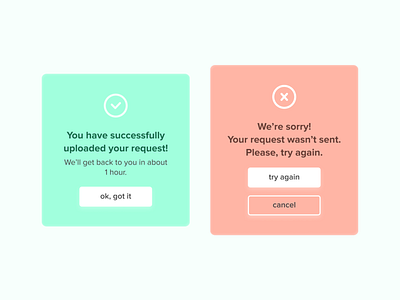
DailyUI 011 Flash message
Hello Dribbblers!
In this daily design task I've set up a goal to create a clean message to users.
If it was a success, what was successful? If it was an error, what error exactly? I think if it's possible we should clearly write it down what went wrong so then users won't be confused.
Also I used soft colors exactly for this reason. When an error occurs to do not make users feel confused about what happened.
More by Julia Malinina View profile
Like
