Rebrand - Field Paper Company Logo
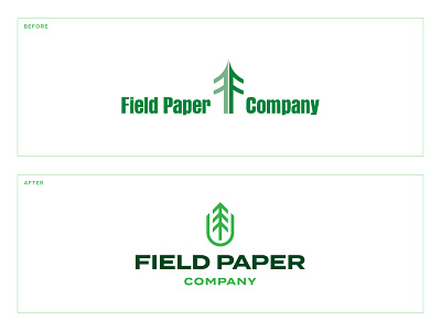
Rebrand for Field Paper Company, a paper distributor located in Iowa and Nebraska. Swipe through to see the before and after!
What do you think?
Overall, I wanted to change where the tree mark was located. It’s current placement causes the logo to feel unbalanced sense it’s not directly center aligned. I also wanted to create something that was more versatile where the tree mark could be used on its own and not paired with the text at all times. As for colors, I brightened it up and created more contrast between the green colors.
I know in the original logo, the tree mark seems to be formed by the letter F. I wasn’t too concerned about keeping that element in my version, yet you get a glimpse of an F in the negative space of the mark (maybe that’s pushing it lol)!
___


