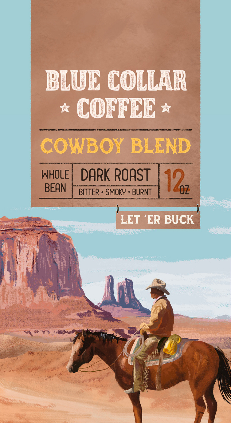
BCC Cowboy Blend Label (2/2)
Packaging design for Blue Collar Coffee's Cowboy Blend. The Cowboy Blend is a dark roast with notes of bitter chocolate and burnt tumbleweeds. Strong enough to put hair on a grown man's chest. Take a sip and get ready to ride! Step 1: 🌞Design the background illustration The wild west illustration served as the biggest inspiration for the creative direction in this project. It features a well-worn cowboy looking out over the desert. This piece is heavily layered with detail, right down to the horizon. Step 2: ☕️Design the Logo Blue Collar Coffee is a rough and tumble coffee brand for your outdoorsy untamed folk. With this in mind, I wanted to keep the logo simple but weathered... You can tell it's been places. The typeface I used is Heavy Crown Inked by Tough Times Co, which I roughed up a little bit. Step 3:🌪Label thumbnails Next, I sketched thumbnails of what the label was going to look like. I played around with a few options before choosing a background that resembled brown butcher paper. The font used for "Cowboy Blend" is Distressed Unrest. The font for "Dark Roast" is Leisure Park by Brethren Design Co. *All fonts used in this project, I recently picked up from Kern Club* Step 4: 📸Product Photography Finally, once all the designs were incorporated and centered, it was time to create some product mockups. Flat designs are great but mockups take the designs to the next level and help the client better visualize the physical product! ✨This might be my favorite project to date! ✨ If you or someone you know is looking for Coffee Branding/Packaging etc, please send them my way! I WOULD LOVE TO WORK WITH YOU
