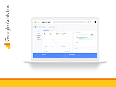
Daily UI #018- Analytics Chart
As someone who is obsessed with data-driven design and decision making it is important that users who utilize the google analytics tools understand the breadth of capabilities, the software has to offer.
I decided to redesign the Google Analytics screen to include a short summary of insights so that people can easily understand the data that is being presented to them. In addition, providing actionable recommendation steps helps users to easily understand what they need to do within the software to improve their stats and reach their business-specific goals.
More by Johanna Dempsey View profile
Like
