Lalamove App - Redesign for Better UX


This was a personal project to improve the UX of the Lalamove app. As a user myself, I felt that the UX was lacking and I came up with a revamp of the current app that I felt would improve the overall experience.
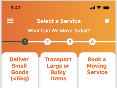
The idea was to have a guided process to help users make the necessary selections and input the correct information as that was currently lacking.
The revamped app will surface more information at each step of the process to improve selection speed and upgrade the overall experience.
I chose to position the buttons at the bottom third of the app to greatly improve the one-handed usability. Based on research on how different users use their mobile phones, we know that the bottom of the screen is the most easily accessible in all modes of usage (one-handed, phone in one hand with fingers from the other hand tapping the screen, and two-handed).
The presentation of information on cards provide a visual guide and visual break to show users the different options available.