Sales CRM Dashboard
The team is available for new projects! Drop us a line: hello@purrweb.com | WhatsApp | Website
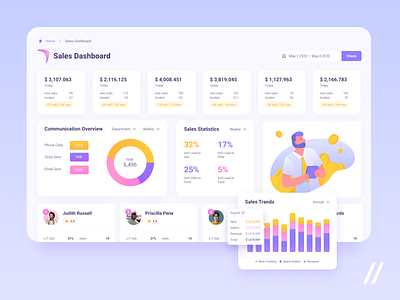
Hey-hey, friends! We’re happy to present to you our design for a website for a company that supports companies and helps them grow. It works as a client database.
📄 On the shot, you can see a sales monitoring panel. It includes sales statistics and feedback base (calls, texts, emails, etc.).
💜 The primary color is light purple. The cold hint doesn’t move the user’s attention away and helps to unify the rest colors. There are three bright colors that emphasize core elements. The brightest is yellow which is an exact opposite to purple — that’s why it’s applied to the most important information blocks.
💻 The main pro of the platform is its reliability. Users will 100% have their money back. The boomerang in the logo says about it.
Created by Purrweb Team
Feedback helps us improve and grow,
We’re keen to hear your thoughts!
PS We know to utilize UI/UX design to make users fall in love with a product. Check out how we used our skills to:
- raise $400k as capital for startup
- streamline cryptocurrency e-wallet
- reboot a Real Estate startup
- help newbies jump into investing
- conquer the chef freelance market
- simplify the life of event organizers
And that's not all — you can find more case studies in our Blog! 💜


