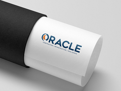
Identity Design for 'ORACLE', A Construction Company
Wanting a strong and bold identity, depicting strength and quality was the first preference of the brand.
Regarding the Symbol which plays the role of a 'O' I have tried depicting a turning road,
Being into construction the brands main agenda was to show reliability therefore making the Blue Color prominent, and Orange is creating an attraction for the Brand.
View all tags
Posted on
Sep 28, 2020
More by Saloni View profile
Like

