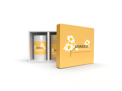
SOAKED. Packaging Design
Through research I discovered that the impact of social isolation brought on by the nationwide lockdown in response to the global Coronavirus pandemic, has had a major negative impact. on people around the world, with the number of people suffering from mental health issues increasing.
My research showed that taking hot baths has been proven to help people suffering from mental health issues. According to Thomas (2019) this is due warm water from the bath which increases your body temperature and a raised temperature at night can help synchronize our natural circadian rhythms, helping create better sleep patterns. An article by Peter Bongiorno also suggests that baths can even help create chemical changes in the brain by decreasing stress hormones and increasing serotonin levels.
Based on these finding I decided to create a bath relaxation set, which includes a candle and bath salts. I specifically chose these items as they are both linked to aromatherapy and plant therapy which is believed to help induce relaxation and combat stress, anxiety and depression. I chose to use chamomile as the fragrance because research suggests that the chamomile plant holds multiple health benefits, including mental health benefits such as relieving stress, anxiety and depression.
When it came to the design of the box my aim was simplicity. People suffering from mental health feel overwhelmed already and the aim is not to leave them feeling more overwhelmed after seeing the relaxation kit but instead hopefully help them feel a sense of calm and a sense of excitement to want to use the kit. This was the base on which my idea was built and on which all my design choices were made. I chose to use a colour palette of yellows and oranges as these are known to be happy colours as well as calming colours. The name of the brand, SOAKED, was developed from the idea of bathing and soaking in aromatherapy bath salts, letting all the problems fade away and the tension release from your muscles as you soak in the warm bath. I chose to use the chamomile flower as my symbol for the design as I believed it emphasized the calming concept of the overall design and linked to the fact that chamomile has calming properties.


