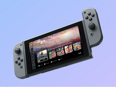
Nintendo Switch UI Concept
I'm a fan of Apple's latest UI updates across all their operating systems, and so I thought it would be fun to reimagine the Switch's UI with a similar look and feel.
The biggest difference between Nintendo's original design and this concept was the decision to place the app bar on the left side, rather than the bottom-center of the screen. This new position allows the player to navigate their Switch with their thumb more easily, rather than using the joystick or having to reach farther.
Anyway, let me know what you all think in the comments!
More by Brandon D'Adam View profile
Like
