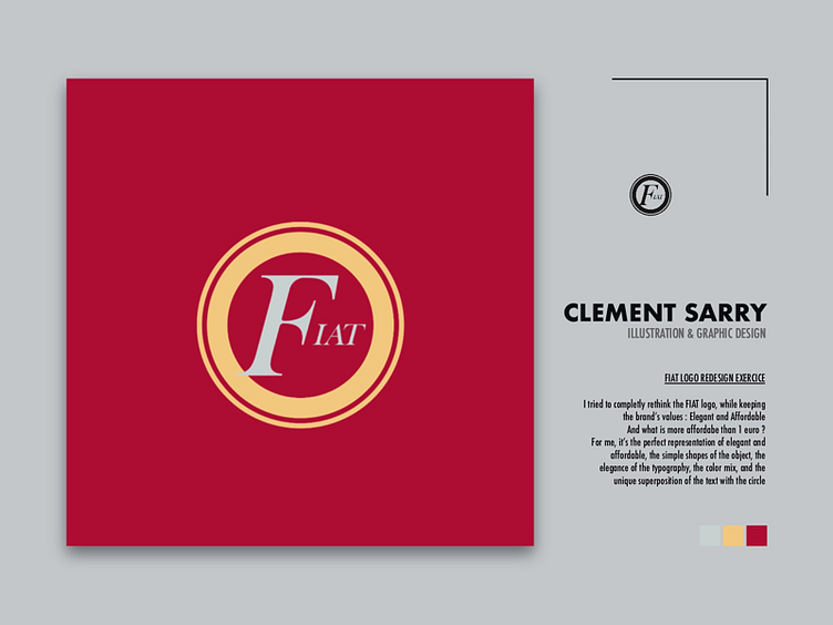
FIAT LOGO REDESIGN EXERCICE
FIAT LOGO REDESIGN EXERCICE
I tried to completly rethink the FIAT logo, while keeping the brand’s values : Elegant and Affordable And what is more affordabe than 1 euro ? For me, it’s the perfect representation of elegant and affordable, the simple shapes of the object, the elegance of the typography, the color mix, and the unique and little superposition of the text with the circle, I'm realy proud of this one, I like the ideas and the result.