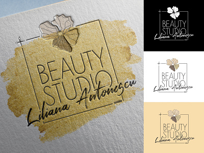
Hair Studio Logo
Hello Dribbble.
I'm Alex and I'm new here.
I'm looking for inspiration, critique and advice from the comunity.
My first post is a logo design for a small Beauty Studio.
I chose a simple clean square design.
A thin, sans serif typeface so the design can breathe. The name in a caligraphy font, intended as a signature but also readable.
The flower was allready a design element within the studio, so i taught it would be a better symbol for the studio and it's easebly reconiseble.
The golden background brings a classy style to the logo, althow it's only used where it fits.
I hope you like it. Feel free to critique and give me tips.
Thank you !
Alex.
More by Alex Antonescu View profile
Like
