Direct Messaging | App chat

Hey guys. ✌️
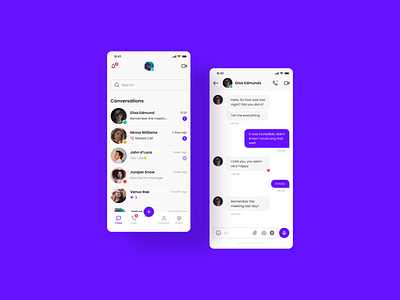
Today I bring the direct messaging Daily UI challenge. The concept I sketched is a chat messaging application.
I chose a rounded and friendly typeface with enough x-heigh and made little adjustments in letterspacing to ensure readability.
This chat app is for all types of public, so I found that blue is the most common and well-accepted color (especially in business) that transmits trust and responsibility. Due to the competition, I tried to choose a color related to blue but a little more energetic and capable of being equally accepted.
So I searched and tried different principal colors and eventually used Electric Purple by Khroma.
This color can ensure enough text contrast to be read by people with visual impairments. (Contrast with white: 6:84:1; WCAG Grading: AA).
I hope you like it and feel free to comment or give feedback to enhance my skills and be more detail-oriented. 🦄
See you next challenge 👋
________________
👉🏻 Typography: Poppins
👉🏻 Iconography: UI Icon Set Tetrisly
👉🏻 Colors: Khroma
👉🏻 Contrast check: Who Can Use
👉🏻 Tool: Figma