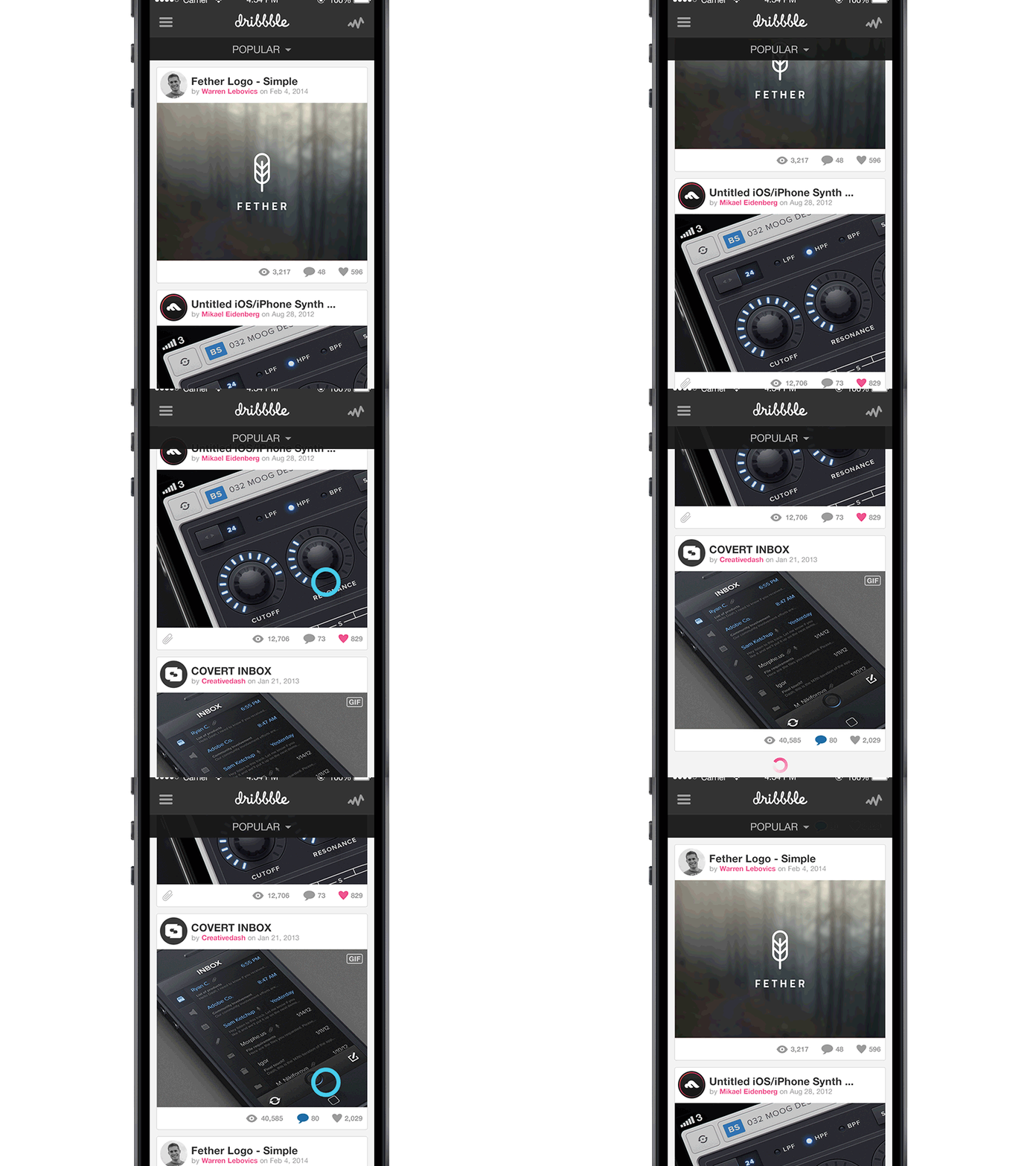
Dribbble Mobile UX
I've been thinking about Dribbble's mobile ux and decided to mock up an idea.
I do at least 50% of my web browsing on mobile. On Dribbble, I often find myself drilling into subpages because I don't see [what I consider to be] enough information in the current two-column layout.
What do you think? Feedback is strongly encouraged!
More by Warren Lebovics View profile
Like
