Travel App UI/UX Design
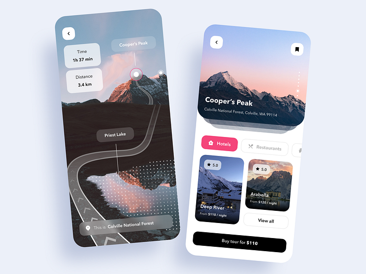
How's it going, friends? I’m got a new shot: a design for a travel app that allows users to buy travel packages, book hotel rooms, check available spots to eat, and find the best attractions! 😻
⛰The left screen works like a guide to a museum: it takes the tourist who bought a tour over the place. For example, if the user buys a tour that includes an outing at the top of a mountain, he/she can open the in-app cam and track an arranged itinerary. The app will show all landmarks the user may face during the walk, estimate the time needed to complete the route, and the distance.
🚶🏻♂️The right one is a touring screen where users can bookmark tours, go through pics and hotels, restaurants, and entertainments nearby.
❤️ I'm not scared of breaking the rules! Do not veto the combination of dark and reddish colors — it can be pretty good sometimes.
📲The neuronet of the app makes sure the user won’t miss anything must-see.

