Biedronka app - wireframe concept

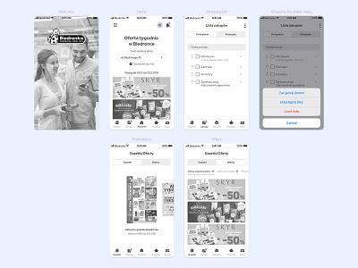
Hey there 👋 , In short, some time ago I noticed that the current Biedronka app is overwhelming and old-fashioned, so I decided to create a concept for a new iOS app and this is how this mockup was born. I chose only the key features so that the user doesn't feel overwhelmed. Everything is nicely grouped and presented transparently. Because Biedronka has a lot of content in the current app, and they will probably want to transfer most of them, a new concept based on clear backgrounds and appropriately selected free spaces between individual elements will be a good solution here. The main goal would be to create a clear interface, so I use a white background, shades of grey and colours from their current palette as a contrast to the bright interface - everything is readable and easy to use.
Selected new functionalities:
• E- receipt - storing receipts
• Barcode reader - checking product prices
• Adding products to the shopping list from the offer that is currently viewing in the app - you like the product from? Click "+" and add it to the shopping list
• Sharing a shopping list
• Finding stores on the map - you can also mark the one you use as "my favourite store"
• Push notifications - when you marked "my favourite store" you can receive notifications about current promotions and offers
• Loyalty card
• Culinary recipes
• Adding products to your shopping list from culinary recipes
That's all for now 🤷♂️
----------------
Love and follow me for more stuff 🙃
I'm available for new projects!
➡ czarnackigrafika@gmail.com ⬅