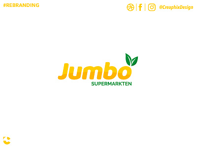
Jumbo Supermarkets #2 - LOGO REBRAND
This is the previous logo but then added with colors.
Text from previous post:
"Today I made a Logo Rebrand.
I was looking at the shopping bag from the Jumbo Supermarket, and I thought it wasn't that nice. Jumbo is a big supermarket in the Netherlands.
So when I got home, I decided to redesign this logo in something to show more of a supermarket.
I changed the BOLD font to a more friendly font, even when it represents "Jumbo", I thought it looked better. Added some leaves and the text "Supermarkten"
Tell me what you think! :)"
More by Jeroen van Pelt View profile
Like
