Premium Watch Store Design

The team is available for new projects! Drop us a line: hello@purrweb.com | WhatsApp | Website
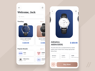
Howdy, guys? We want to show one of our recent designs. This one was prepared for an online watch store. 🤟🏻
📲. On the left shot, it’s the main screen of the app: here users see trendy watch models and popular brands; on the right shot, it’s an example of a product card: here the user can swipe a product, check out a 3D model and read detailed info.
👩🏻🎨. The core colors are pastel beige and navy blue — they create a great contrast, and support the light interface.
⌚ Online stores are a common thing. Yet we applied our UI/UX skills to deliver one that is easy to use and cool to see. Plus, it presents 3D models.
Created by Valery Boyko
Show us your LOVE - smash L button on your keyboard
We share experience in designing interfaces for healthcare startups 🏥, give insights into developing an app for pet owners 🐈, and reveal the secrets of coming up with a competitor to famous services 🤩
Keep in touch and check out our recent news 💜