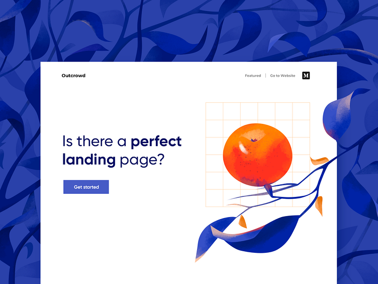
A Perfect Landing Page - Blog Post
Hello, creatives!
We have another important topic to discuss. A landing page design and development are among the most common projects we have from our clients (we think you too).
Sometimes we were asked if there is a perfect landing page? Based on our experience we can say that a perfect landing page is like a store window displaying something beautiful that you really want to buy. And the price is right, too! You waste no time entering the store to take a closer look at the item. A minute later you’re at the checkout, paying for your purchase. What a lucky find!
Most landing pages, however, resemble overstuffed display windows that you pass by without noticing. Why is that? Where do the designers and developers fail? We have the answers in our article "The Perfect Landing Page: Myth or Reality?"
Also, it is Friday already and what does this mean? Few hours of work have left to go into relaxation mode and recharge your inner batteries at full capacity. As we will have the last warm days the Outcrowd team has some plans for them!
Have a great weekend!
***
Drop us the line hello@outcrowd.io
Be a part of our creator’s community at: Medium | Instagram | Twitter | LinkedIn | Facebook
