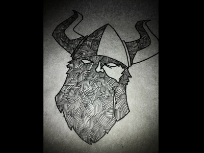
Viking Sketch Redux
Ok. Here's another version. It's much better I think. Not sold on the highlight thingy in the beard though. I like the horns better in this one. They're more squarey which is cool. And I squared out the beard more. The previous one could be a football with horns—I wasn't crazy about the shape. Plus it looks like a rocket upside down. Anyway, thoughts and critiques are encouraged.
More by Paul Sirmon View profile
Like
