User Testing for After School Manager Platform
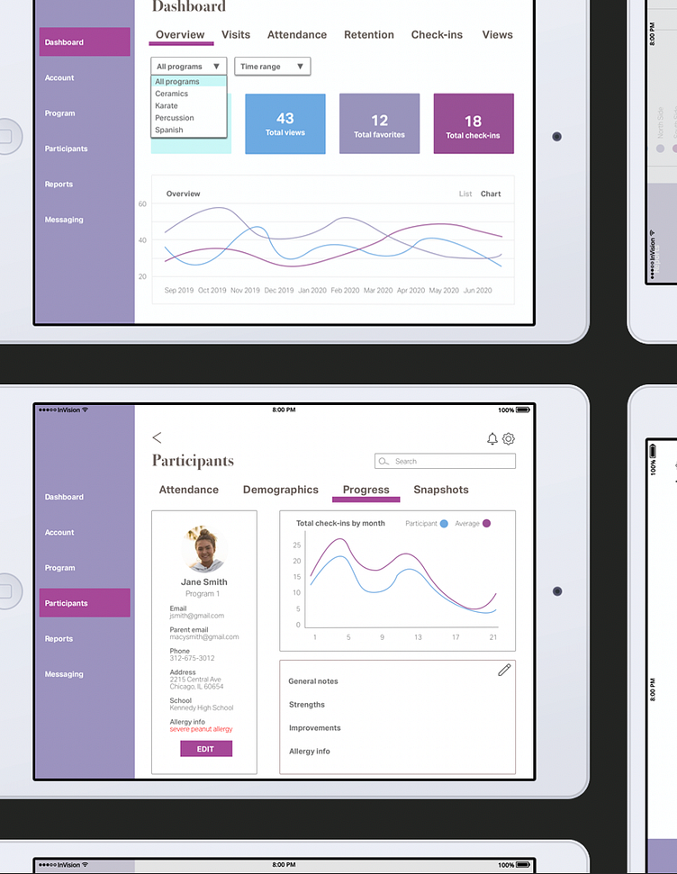
Several months ago, I created a hypothetical platform called Recess geared towards after-school program managers, based on a set of (poorly implemented) wireframes. While it would be a multi-sided platform, we were to focus specifically on the administrative side.
While the designs and prototype were entirely my own, I collaborated with a team of three other designers for aspects of the project such as competitive analysis and user testing. My team and I interviewed relevant users to gather feedback on our progress to implement into each of our next design iterations.
We asked each participant a series of questions about our designs (including things like what the color schemes reminded them of, and if they found the typography easily legible), as well as had them see if they could easily perform tasks in later stages, such as editing student notes.
We did three sets of interviews throughout the design process, with four participants each. Once my team divided into pairs, I interviewed half the users, and was the notetaker for the other interviews. The majority of our participants had a background in education and/or after-school programs, so they had a better sense of the scope of the project, and were able to let us know what was successful and what could be improved.
Our interviews revealed a number of key insights, which I made sure were reflected in my final designs:
• Most users wanted to see the use of color incorporated into the designs • It is important to make the platform accessible to older users who may not be as tech-savvy • Nearly all users favored simple designs over busy or cluttered ones • Student allergy information is essential
While user testing is important in pretty much any project, I found these insights particularly valuable, as I had no sense of what an after-school program manager is looking for in a platform. By the end of each interview, I had more knowledge that helped me on my next iteration.
