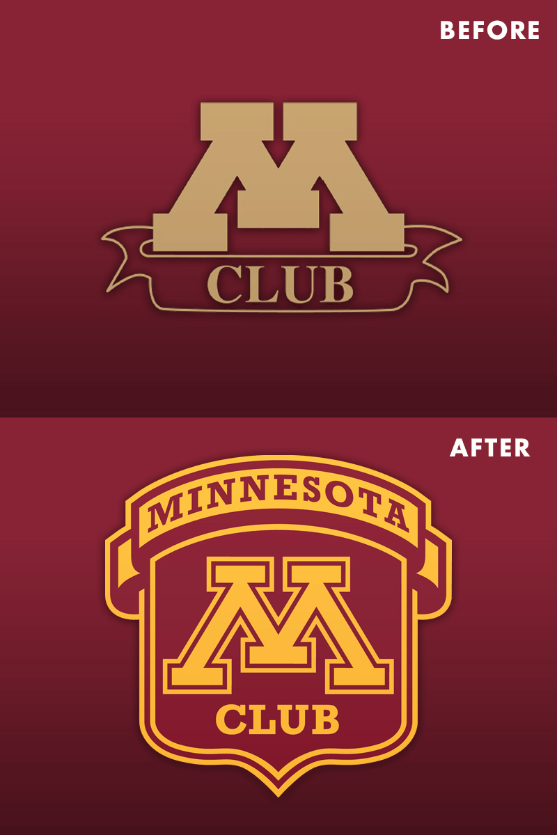
"M" Club Rebrand
This is a rebranding project that I am wrapping up. The "M" Club is comprised of athletes who have won letters at the University of Minnesota.
There's some goofy things about the old logo that I actually liked, but that banner was jacked so we needed to upgrade it. The whole concept was to make the logo look similar to the letter pins that "M" Club members receive.
Some of the things we needed to upgrade - Use our current Block M with the double stroke - Use our current colors - Use Rockwell, one of the typefaces in our branding
Input and crit welcome!
More by Niko Alexander View profile
Like
