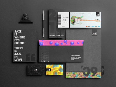
Festival Stationery 🎸
We found that design around jazz could often look dated. Our approach was to stay away from this and make sure the new image appealed to a younger audience. Therefore, instead of using custom typography or 2D illustrations, we decided to go the other way.
You may also like our:
Festival Teaser Video
https://bit.ly/3ccag33
Festival Opening Titles
https://bit.ly/3my9z8N
Festival App
https://bit.ly/32LJXgS
Full Festival Identity
https://bit.ly/32M4IZT
Show us your love by pressing "L" and Follow for more new design updates.
Thanks!
More by bezlad View profile
Like
