Tokio Branding
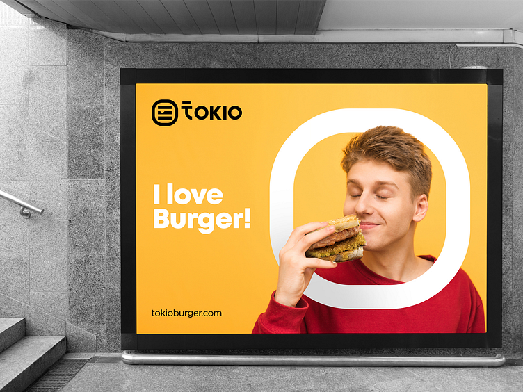
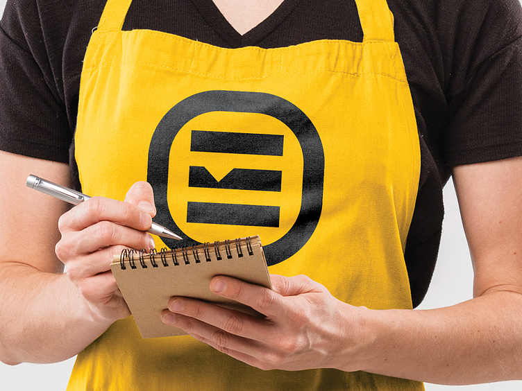
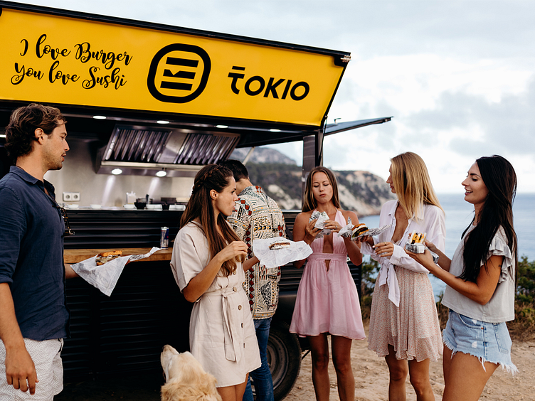
BRIEF Here is a logo designed for www.tokioburger.com , a fast food restaurant selling Sushi Burgers. I designed a logo combining symbol and wordmark that is simple, easily conveys the nature of the business and ultimately, cool as desired by the client.
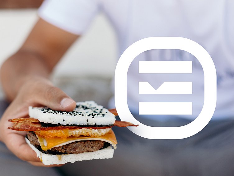
CHALLENGES Though the name of the Company was a short one, the client preferred a minimal logo to be used across all social media platforms. Being a minimal logo, the detailing needed to be retained. Also, the Restaurant dealt with Sushi burgers. Unlike normal burgers, Sushi burgers contained a square shape, which also needed to be catered to. The client also requested that since these burgers were Japanese burgers, there needed to be an element of Asian look as well and reminded the customers of Japan.
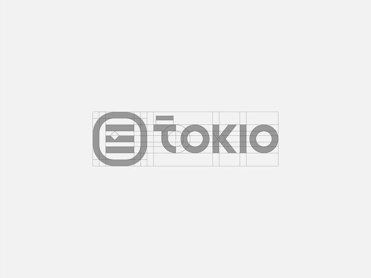
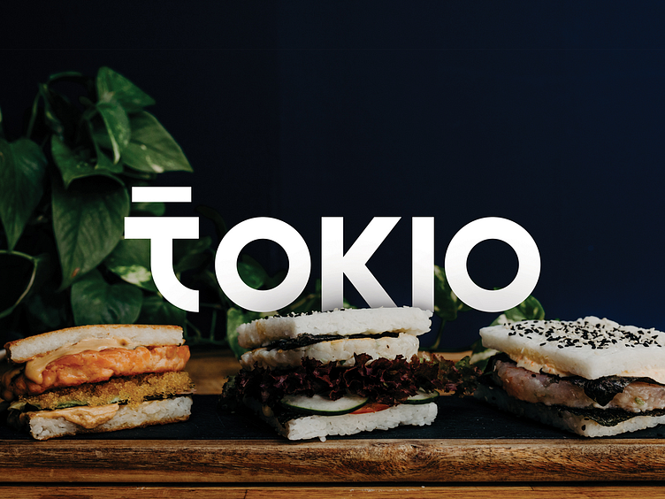
SOLUTION The solution was a unique icon plus typography option presenting an abstract form of the Sushi burgers. I did intensive research on the typography and customized the typography wholly so as to reflect a Japanese feel, especially the primary letter of the Brand ’t’, which has been customized to look like Japanese letters, inspired from “Katakana”, a component of the Japanese writing system. A visual identity that was visible and adaptable to any transformations as in size, turning out to be memorable, leaving an impression in the minds of every satisfied customer was thus created.
For Branding/Logo Design? 📧 Contact: spgmarks@gmail.com or DM