Dashboard UI Design
Hey guys,
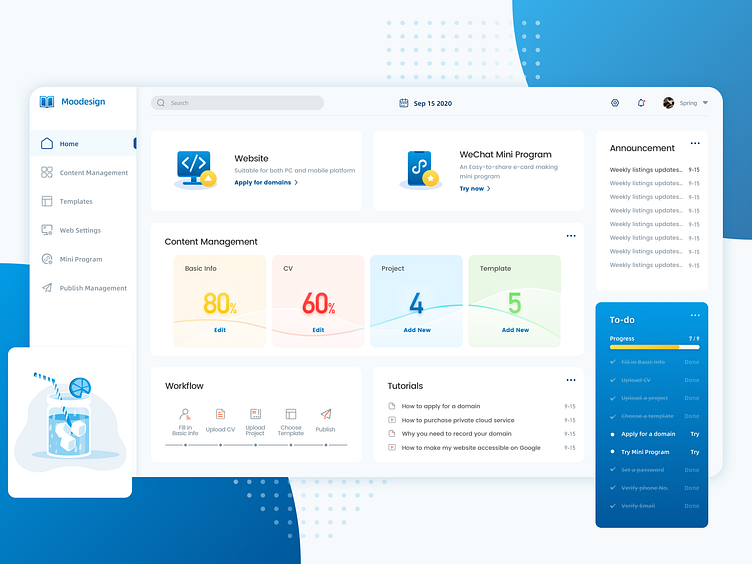
This is the dashboard page of the project that I'm currently working on.
I am trying to use rounded corner cards to organize contents within the same group. And using different types of shadows to indicate the hierarchy between layers.
I choose gradient blue to be the main color of the system, and add ice cream colors to make the interface more harmonious.
Thanks for watching! Pls press "L" to show your love😘
More by VincentSun View profile
Like
