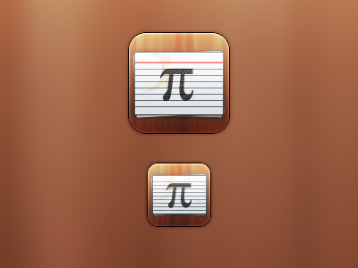
Stacks Icon (Help!)
The Retina Display and iPad versions of the previous App Icon.
Please temporarily ignore any advice you might have on the technical execution of this icon, as I have something more important to ask of you.
This icon is for an idea that I had for an App , one that I'm starting to design. The idea is an App to create, and study from, stacks of flash cards. Like a real stack of flash cards, you can input text to display on the front and back. To study, it will choose a random card from the stack and display the front, you can then tap a button to display the back.
I'm pretty set on that idea, but of course if you have any advice on it I'd very much appreciate it.
So having heard it, how well do you think this icon represents the idea of the App? I've had a few (non-designer) friends tell me that the Pi symbol should be more hand-drawn, or that I should replace it with something else. Do you agree?

