Redesign of Craigslist
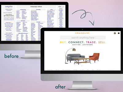


Well, I know what you are thinking - if it ain’t broken, why fix it? While it is true, there are companies, like Craigslist, that are still using outdated website designs. Not sure whether the company is afraid of change or don’t have it as a priority (if it ain’t broken, why fix it?). Well, either way, I have decided to revamp their website by creating a user-friendly website.
Why this website looks bad?
At first glance, what do you see? All I see is a small blue text that makes it hard for users to read (accessibility is a no-no here). Second, I am not sure where my eyes need to go first. Nothing on the page is telling me “I need to do this action.” Third, the web page is not responsive. Makes it hard to scroll right to left to see the full list.
How can it be improved?
Changing a few things, like text, color, placements can be a huge improvement to the website. But I decided to dig a little deeper and redesign the whole page to make it user-friendly with better search functionality, buyer page, and filters.
