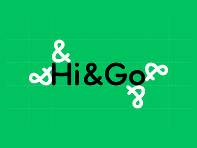
Hi&Go logotype
A brief was to design a logotype for family car rent company Hi&Go. The brand concept and the rest of the detail was telling to make a simple, friendly-looking logotype. The solution was to use round corners and customize letters like & to get the best kerning and readability proportion. Of course, the horizontal letter H and G parts modified to remind a smile.
A full project coming soon. By that time you can check other projects here:
https://www.behance.net/TwelveMoons
2020
More by Twelve Moons View profile
Like


